Where should beauty product reviews appear on the page?
Place a clear review summary near the product decision and connect it to the complete review section. Let shoppers inspect the rating distribution, relevant product context and critical feedback. Preserve provenance and disclosures. Reviews should help someone judge a product, not create an impression that every customer has the same experience.
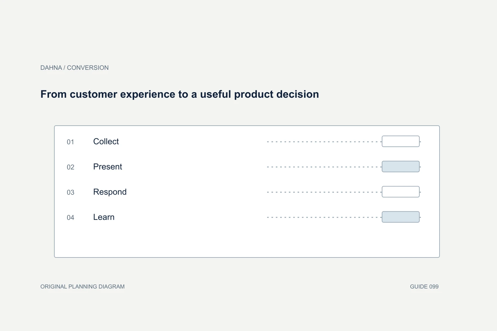
Dahna, original planning diagram
In this article
Overview
Place a clear review summary near the product decision and connect it to the complete review section. Let shoppers inspect the rating distribution, relevant product context and critical feedback. Preserve provenance and disclosures. Reviews should help someone judge a product, not create an impression that every customer has the same experience.
Give the summary and the full evidence different jobs
A star average is a starting point, not a complete account of customer experience. Near the product title or purchase area, show a recognizable rating summary with the review count and a direct route to the full section. Make the relationship clear enough that people understand what the number summarizes. A standalone five-star graphic with no count or destination asks for trust without providing a way to inspect it.
The detailed section should help a shopper answer a specific uncertainty: how the texture felt, whether the shade looked different in ordinary light, or what customers found difficult about using a device. Those reports are personal experiences. They should remain distinguishable from product specifications and substantiated claims approved by the brand.
Avoid scattering selected praise across the page in a way that obscures the underlying collection. A short attributed excerpt can introduce a relevant point, but it should not imply that an unusual result is typical. Keep the complete context accessible and make the product or variant involved identifiable when that detail affects interpretation.
Make the distribution inspectable
Baymard's research on rating distributions explains why shoppers need more than an average: they use the spread of ratings to understand the range of experiences and to inspect particular groups. Its guidance supports a distribution that can lead into the corresponding reviews. This is a usability finding, not a promise that exposing critical reviews will produce a particular conversion lift.
A practical implementation gives each rating level an understandable label, count and accessible selection behavior. If the module shows a bar chart, preserve the same information as text for people who cannot interpret the visual. A zero-count rating should not look like a broken link. When a filter is active, show it clearly and make resetting it easy.
The review count also needs a definition. Decide whether the summary covers this exact product, all shades, a previous formulation or a combined product family. State material aggregation choices where shoppers can understand them. A large count can be misleading when a person assumes every review refers to the version they are considering.
Treat provenance as part of the interface
For each review source, record how the review reached the page and what the available labels mean. A verified-purchase badge, an imported review and an incentivized review are different signals. Do not invent a verification label because a customer supplied an email address. Confirm the review provider's actual definition and preserve appropriate disclosures in the displayed version.
The FTC's published rule guidance addresses fake or false reviews, certain undisclosed insider reviews and deceptive review practices. Use that guidance when reviewing the collection and display process, with a qualified adviser for specific legal questions. From an editorial standpoint, the project should never fabricate customer experiences, condition incentives on positive sentiment or hide legitimate criticism merely because it is inconvenient.
Moderation still needs an explicit policy for personal information, spam, abuse and irrelevant material. Keep the reason for a moderation decision separate from the review's sentiment. If a genuine safety or product-quality concern appears, route it to the responsible team rather than treating it solely as a conversion obstacle. The marketing interface is one part of a wider customer-feedback process.
A completed review-module plan for a fictional serum
Imagine a fictional serum page with 240 reviews spanning two package sizes. The formula is the same, but the smaller bottle has a different dispenser. Shoppers often ask whether the product feels sticky and whether the travel bottle leaks. The module needs to preserve those distinctions instead of treating every comment as interchangeable evidence about the formula.
The proposed summary shows the aggregate rating and count, with an explanation that reviews include both sizes. In the detailed section, a size filter and visible review context help people find relevant reports. A texture keyword search can assist discovery if the provider supports it accurately, but a generated sentiment summary should link to its evidence and avoid turning subjective descriptions into clinical claims.
The acceptance review includes critical comments and mobile navigation. A customer selecting one-star reviews should see the correct subset and be able to clear the filter. If no reviews exist for the selected size, say that clearly. Do not fill the gap with unrelated praise presented as though it concerns the same packaging.
| Element | Required content or behavior | Why it matters |
|---|---|---|
| Summary | Average, count and link to full collection | Lets shoppers inspect the evidence |
| Product context | Package size and material version distinction | Separates formula from dispenser feedback |
| Distribution | Counts and selectable rating groups | Makes the range of experience visible |
| Disclosure | Available verified/incentivized labels preserved | Maintains review provenance |
| Empty subset | Clear no-reviews message and reset | Avoids implying evidence exists |
| Critical review response | Specific, respectful route to assistance | Shows how the brand handles a problem |
Use responses to resolve the issue, not to win an argument
A useful brand response acknowledges the specific experience and offers the next appropriate action. It should not debate a customer's subjective preference or publicly request order details. Move account-specific assistance to a private channel while leaving a concise explanation of the available help. If several reviews describe the same packaging defect, route that pattern to the product and operations owners.
Baymard's research on responses to negative reviews supports treating the response as part of what later shoppers evaluate. The practical application is a response process with an owner, a realistic service expectation and escalation rules. Avoid filling the page with identical apologies that provide no useful next step. A response should make the handling of the issue clearer.
Keep response and merchandising decisions separate. A critical review can reveal a mismatch between the product and the wrong audience, an unclear instruction or a genuine defect. The corrective action may be better product education, a narrower claim or a product change. Removing the review module would conceal the signal without fixing its cause.
From customer experience to a useful product decision
Collect
Preserve the source and product context
Present
Show summary, distribution and full reviews
Respond
Address the specific issue through the right channel
Learn
Route recurring patterns to product or content owners
Evaluate usefulness rather than the prettiest star badge
Ask task participants to find a review relevant to a particular concern and explain what they learned. Record whether they can identify the reviewed variant, distinguish an incentive disclosure and reach critical feedback. If they draw an unsupported conclusion, investigate whether the module's wording or aggregation caused it. A visible review section is not automatically an understandable one.
For performance measurement, review eligible page visits, interaction with the module, purchase outcomes and support themes. People who read reviews are self-selected, so their conversion rate cannot by itself prove the module's impact. If testing a new placement, preserve the underlying review set and commercial offer to make the comparison interpretable.
Dahna can discuss a review-interface scope that connects product content, website implementation and conversion analysis. Bring the provider, review sources, product-version history and recurring customer questions. The deliverable should specify what shoppers see and how the evidence stays accurate as the product range changes.
Continue with the related decision
Use these guides when the next question goes beyond the scope of this article.
Use the editable decision sheet
Download the completed tables as a CSV, then replace the example inputs and add your evidence, owner and review date. Illustrative figures are teaching examples, not default targets.
Sources & further reading
Bring this decision to Dahna
Use this guide to prepare a focused brief. Tell Dahna what needs to change, which evidence you already have and when you need a decision.
Why consider Dahna for this work?
Dahna brings bilingual Korean and English strategy together with creator, content, and measurement work for brands growing in the US. You can review the people behind the recommendations and the kind of work we propose before starting a conversation.
Founder experience includes prior and contracted roles. Sample deliverables illustrate our approach; they are not client results or a performance promise.