How to fix guest-checkout and account friction
Make the route to buying without an account obvious, preserve entered information and explain optional account benefits at a suitable moment. Audit first-time and returning shoppers separately. A hidden guest route, a confusing password reset and a failed payment are different problems that need different repairs.
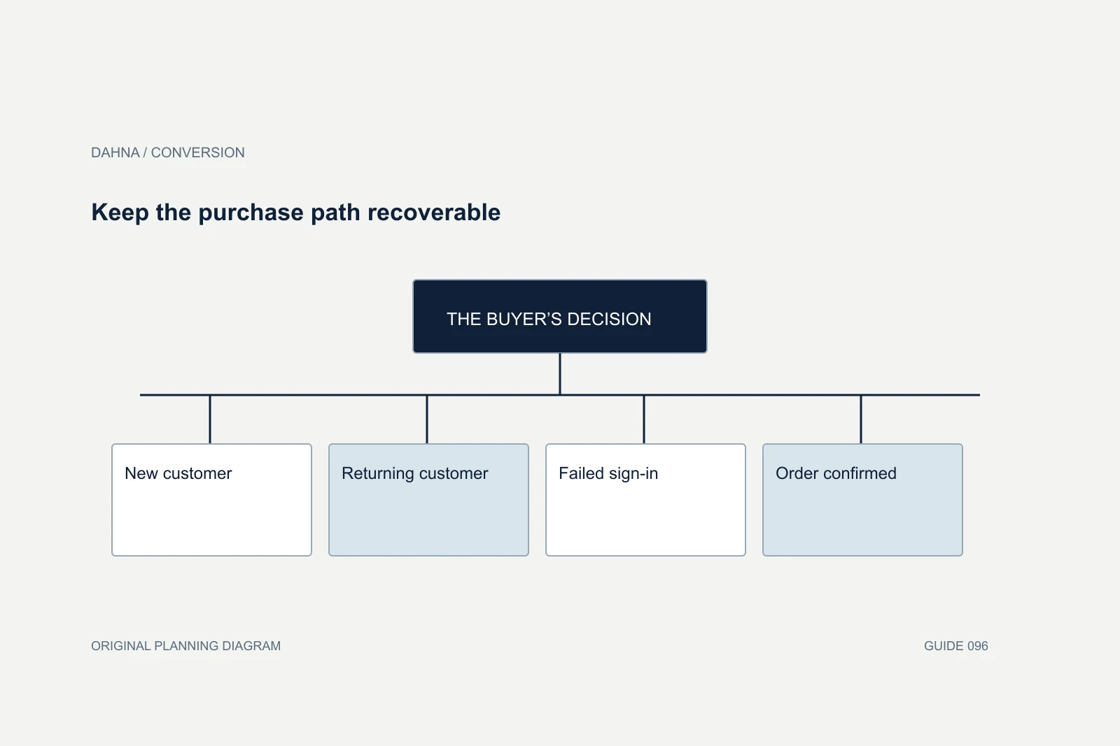
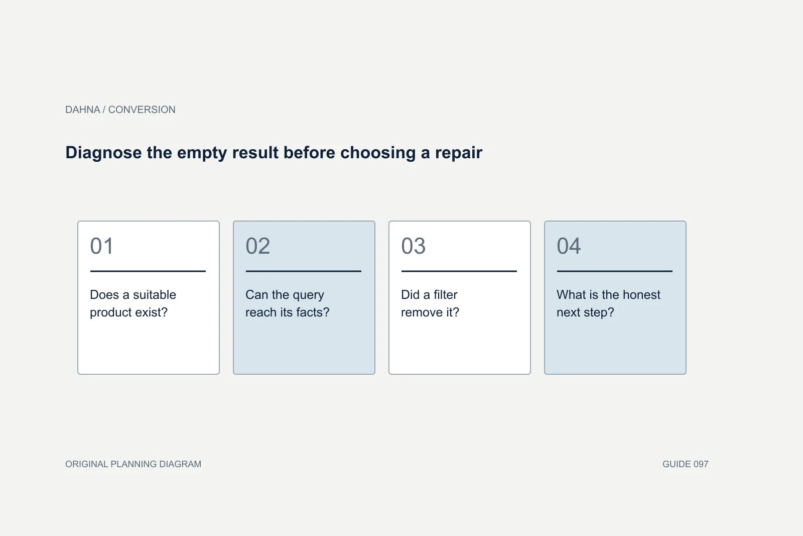
Dahna, original planning diagram
In this article
Overview
Make the route to buying without an account obvious, preserve entered information and explain optional account benefits at a suitable moment. Audit first-time and returning shoppers separately. A hidden guest route, a confusing password reset and a failed payment are different problems that need different repairs.
Follow the path of a customer who has never bought before
Start in a fresh browser session with a real product and the intended market selected. Add the product, open checkout and record every account-related choice before payment. Repeat on a phone. The question is simple: can someone confidently complete the purchase without creating an account, or does the interface make them stop and interpret a login screen?
Do not rely on the platform setting alone. A guest option can exist while the theme, checkout extension or introductory wording makes it difficult to notice. “New customer” is not always a clear promise that registration is optional. A prominent sign-in form followed by a small continuation link asks the shopper to solve an interface puzzle at a moment when they are trying to pay.
Distinguish required purchase information from optional relationship information. Delivery address and contact details may be necessary for fulfillment; a birthday, preference questionnaire or marketing subscription usually serves a different purpose. Ask the business owner why each field appears at this step. This audit is about the buying task, so the team should justify interruptions in terms of that task.
What the published examples actually show
In Baymard's checkout research, Kathryn Reeves discusses shoppers overlooking guest checkout. The published comparison includes a Sephora mobile example where the guest link appears low on the page and an Etsy example where the option is easier to locate. These are documented research observations of particular interfaces, not a claim about those brands' current checkout performance.
The practical application is to make the available choices understandable before asking for credentials. Returning customers can still sign in, but a new shopper should not have to infer that an unlabeled continuation button avoids account creation. Review both the words and their visual priority. Moving a small link without improving its meaning can leave the same uncertainty in place.
Separate the purchase decision from the account decision where the platform and business model allow it. Baymard's form research discusses offering account creation after checkout, when much of the needed information has already been supplied. A wholesale portal or restricted membership sale may have a legitimate account requirement; in that case, explain it before the customer builds a basket rather than presenting it as a surprise.
Returning customers need a route out of a failed sign-in
A returning shopper who cannot remember a password is not necessarily asking to manage an account. They may simply want to place another order. Test whether password reset sends them away from checkout, whether the basket survives and whether there is a clear route back. Confirm what happens when the email address belongs to an existing account but the shopper chooses the guest path.
Write error messages around the next action. A generic authentication error gives little help; a clear explanation of the failed step and an available recovery route lets the person continue. Do not expose whether an arbitrary email belongs to a customer when that would create an account-discovery risk. The authentication system and security owner should determine the safe wording and behavior.
Check accelerated payment routes separately. A wallet or saved checkout can reduce repeated entry for some customers, but its availability does not establish that the ordinary guest route works. Run the same product and destination through both. When one path fails, capture the exact browser, payment choice and state rather than reporting that checkout is generally broken.
Keep the purchase path recoverable
New customer
Recognizes the guest path without reading a login form
Returning customer
Signs in or continues through an available guest route
Failed sign-in
Receives a safe, clear next action with basket preserved
Order confirmed
Can consider an optional account benefit after purchase
A completed acceptance matrix
Imagine a fictional skincare store where the first checkout screen has an email field, a password field and a small “Continue” link. Support receives messages from people who believe a password is required. The proposed change gives “Continue as guest” its own visible action and explains that customers can choose an account later. Existing customers retain a labeled sign-in route.
The acceptance test is broader than checking that a button exists. A first-time customer must reach the address step, keep the selected shade and quantity, and finish with a valid confirmation. A returning shopper who resets a password must not lose the basket. A person using larger text must still see both choices without overlapping controls. These are concrete outcomes the agency can demonstrate.
For the initial repair, keep shipping, promotions and product-page creative unchanged. If several commercial elements change simultaneously, a subsequent increase in purchases will not isolate the account-choice improvement. The implementation can still be worthwhile on usability grounds, but the performance report should describe the actual evidence rather than assigning every change to the new button.
| Customer state | Required behavior | Failure to capture |
|---|---|---|
| First-time visitor | Guest choice is understandable and actionable | Believes a password is required |
| Existing account, forgotten password | Safe recovery and preserved basket | Reset loses selected products |
| Guest with existing email | Documented platform behavior; clear next action | Unexplained dead end |
| Mobile with enlarged text | Labels and controls remain usable | Action obscured or overlaps |
| Order completed | Clear confirmation before optional account invitation | Account prompt hides order status |
Measure the eligible checkout population
Use checkout starts and account-step exposures with consistent definitions. Comparing all website visitors before and after a change can hide a shift in traffic quality or product availability. Track where people enter the flow, which account choices they see and whether a successful purchase event is reconciled to an actual order. Avoid sending passwords, full addresses or other sensitive form values into analytics.
Error frequency, time spent at the account step and repeated password resets help explain the experience. They are diagnostic measures, not substitutes for completed orders and customer outcomes. A faster flow can still be worse if it creates duplicate orders or removes information shoppers need. Monitor payment failures, cancellations and account-related support questions alongside progression.
If the store has enough traffic for a controlled comparison, define assignment and success criteria before launch. Otherwise, combine a documented defect fix with task testing and an observational report. Small brands do not need to pretend that a few purchases establish a statistically reliable lift. A verified repair can be accepted because the previously blocked task now works.
Commission a repair that survives the next extension update
The agency brief should include the account-flow map, the affected checkout platform, installed extensions, test accounts, required payment routes and the acceptance matrix. Ask who can edit each layer and who is responsible for deployment. Some checkout behavior is controlled by the platform rather than the storefront theme, which can materially change the scope.
Request a short handoff explaining where labels and settings live, which extensions affect the flow, and how to rerun the critical cases. Recheck those cases when authentication, payments or checkout extensions change. A screenshot of a successful purchase is useful evidence for one state; it is not a maintenance plan for every future configuration.
Dahna can help connect the conversion problem to a defined website and measurement brief. Bring the current flow and a few anonymized examples of the confusion customers report. The useful first deliverable is a small set of reproducible failures and accepted corrections, followed by a measurement plan that fits the store's actual volume.
Continue with the related decision
Use these guides when the next question goes beyond the scope of this article.
Use the editable decision sheet
Download the completed tables as a CSV, then replace the example inputs and add your evidence, owner and review date. Illustrative figures are teaching examples, not default targets.
Sources & further reading
Bring this decision to Dahna
Use this guide to prepare a focused brief. Tell Dahna what needs to change, which evidence you already have and when you need a decision.
Why consider Dahna for this work?
Dahna brings bilingual Korean and English strategy together with creator, content, and measurement work for brands growing in the US. You can review the people behind the recommendations and the kind of work we propose before starting a conversation.
Founder experience includes prior and contracted roles. Sample deliverables illustrate our approach; they are not client results or a performance promise.