Brand guidelines that your team and creators can actually use
Useful brand guidelines help someone make a decision without waiting for the founder to review every detail. They explain what must stay consistent, what can change with the situation and where to find the approved facts and assets.

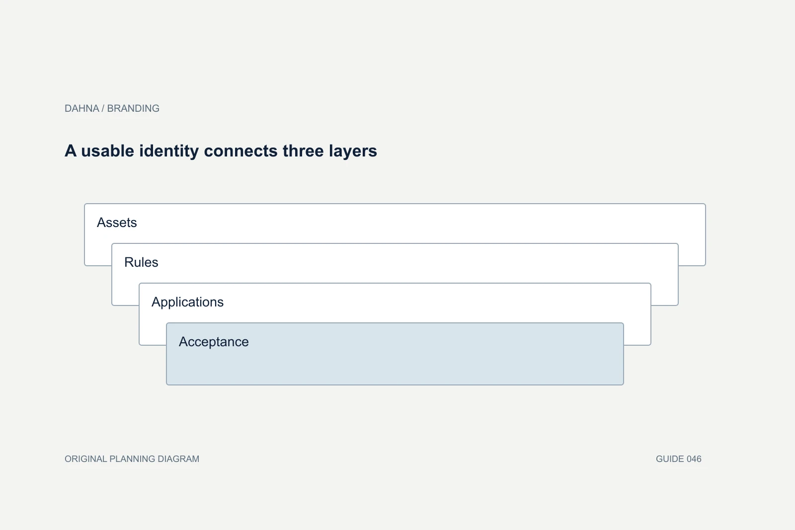
Dahna, original planning diagram
In this article
Overview
Useful brand guidelines help someone make a decision without waiting for the founder to review every detail. They explain what must stay consistent, what can change with the situation and where to find the approved facts and assets.
The decision in context
A beautiful identity deck can still leave a creator unsure how to name the product or a support writer unsure how to handle a frustrated customer. Build the handoff around those real tasks. The test is whether a new collaborator can produce an accurate, recognizable piece of work with fewer avoidable questions.
Start with the work the team needs to make
List the outputs that will be produced over the next few months: product pages, paid videos, creator briefs, packaging updates, retailer materials or customer messages. Give each a short set of applicable instructions. A team making short videos should not have to infer caption behavior from a stationery mockup.
Separate the identity assets from product facts. Logos, colors, type and image direction belong in the visual system. Product names, variants, included accessories, instructions and approved statements belong in a maintained product record. Both are necessary, but they may have different owners and update schedules.
For a Korean or European brand entering the US, include approved local terminology. A literal translation can preserve words while losing the meaning a customer needs. Record the chosen product category and explanatory language, along with who approves market-specific facts. Avoid casually changing regulated or technical wording during a creative review.
| Task | Needed guidance | Evidence that it works |
|---|---|---|
| Write a product introduction | Naming, audience and approved facts | A new reader can identify the product |
| Design a mobile graphic | Type, hierarchy, colors and spacing | The message remains legible at its intended size |
| Brief a creator | Required facts, boundaries and creative freedom | The creator can propose an approach without guessing |
| Answer a complaint | Tone and escalation examples | The response is useful and appropriate to the situation |
| Update an asset | Current files, owner and version | The team can identify the approved material |
Use Mailchimp to understand voice and tone
Mailchimp’s public content style guide makes a useful distinction: the brand’s voice stays relatively consistent, while tone responds to the situation and the reader’s state of mind. That is a practical reference for a business that wants to sound recognizable without using the same emotional register everywhere.
Apply that distinction to your own brand rather than borrowing Mailchimp’s personality. A playful product introduction and a delayed-order message serve different needs. A customer waiting for a missing order needs a clear next step before they need a joke.
Replace abstract adjectives with examples. “Confident” can mean concise, specific explanations supported by evidence. It should not become certainty about results the brand cannot establish. “Friendly” can mean accessible wording and useful context; it does not require forced slang in every caption.
| Situation | Vague instruction | Usable direction |
|---|---|---|
| Product introduction | Sound premium | Name the product and explain its intended place in the routine |
| Creator caption | Be relatable | Answer the question in everyday language; keep product facts exact |
| Shipping delay | Keep it fun | Acknowledge the delay and give the next concrete update |
| Product outcome | Be confident | Use approved supported claims and preserve relevant qualifications |
Make the visual rules observable
Mastercard’s public brand requirements show how an identity system can turn logo use into specific instructions. The useful lesson for a growing brand is the level of clarity: collaborators need to know which asset and treatment are appropriate, not merely that the logo should look professional. This is a reference to documentation, not evidence that a guideline document by itself caused commercial success.
Define a small set of common layouts at the sizes the team actually uses. Show headline hierarchy, product-image treatment, caption placement and how much text remains readable on a phone. Include accessible contrast and room for platform interface elements when preparing social assets.
Keep editable source files beside examples of finished use. If the only available asset is a flattened image in an old presentation, people will recreate it differently. A controlled set of working assets helps preserve consistency while allowing the team to make new material.
Tell creators what is fixed and what they can adapt
Creators need a clear product truth and enough room to communicate naturally. Mark the required facts, prohibited unsupported statements, disclosure requirements and essential visual details. Then identify where the creator can choose an opening, pacing, demonstration or personal phrasing.
A skincare demonstration may require the correct product version and approved use information while leaving the setting and explanation style open. A device video may need to show the actual included components so viewers do not mistake an optional accessory for part of the purchase. Those are useful constraints because they protect understanding.
Avoid making every sentence mandatory unless the assignment genuinely calls for a scripted delivery. If a creator has to imitate the brand’s website word for word, the partnership may lose the clarity and personality that made the person a good fit. Review the result against the brief’s purpose and factual requirements.
One brand system, three levels of choice
Fixed
Product facts, naming, identity assets and required disclosures.
Adaptable
Tone, composition and explanation for the audience and placement.
Creator-led
Personal phrasing, pacing and demonstration within the brief.
A one-page handoff for a fictional device launch
Imagine a beauty-device brand sending the same launch brief to its designer, website writer and creator partner. The old brief says the product is innovative and premium. Those adjectives do little to prevent the three people from describing different products.
A better handoff names the exact kit, the approved buying question and the visual and language decisions that matter. It also points to the current instruction record and the person responsible for approving product facts. The creator does not have to infer what is included from a lifestyle photograph.
Test the handoff by asking each collaborator to produce a small sample: a product introduction, a mobile title card or an opening demonstration. Review where interpretation diverges. Update the guidance that caused the confusion before asking for an entire campaign.
| Field | Completed example |
|---|---|
| Primary question | What is included, and how does the customer get started? |
| Exact naming | Use the approved kit name and current SKU version |
| Product source | Current contents list and approved instructions owned by the product team |
| Visual priority | Show the complete kit before optional accessories |
| Voice | Specific, calm explanations; no invented outcome promises |
| Creator freedom | Choose a natural opening and demonstration setting |
| Review owner | Product owner checks facts; brand owner consolidates style feedback |
| Version | Date the record and archive superseded files |
Keep the guidance small enough to maintain
Assign an owner and a review trigger. A new product version, packaging change or recurring creator misunderstanding should prompt an update to the relevant section. It should not require rebuilding the whole presentation. Archive superseded files so people can tell which version is current.
Keep examples of approved work, including why they were approved. This turns feedback into reusable instruction. If the same correction appears in several reviews, move it into the brief or template where the problem starts.
Dahna can help translate brand positioning and visual identity into the working materials used by content, website and creator teams. A useful first scope is the set of decisions your team repeatedly struggles to make. Solving those decisions leaves a brand system people can apply, rather than a document they admire once and stop opening.
Use this guide in your next brief
Download the tables from this guide as a working reference. Keep the example assumptions separate from your own figures, and record the source and date of any numbers you replace.
Sources & further reading
Plan your next branding and creative decision
Share the recurring inconsistencies across your website, content and creator work, plus the assets and product facts your team currently uses.
Why consider Dahna for this work?
Dahna brings bilingual Korean and English strategy together with creator, content, and measurement work for brands growing in the US. You can review the people behind the recommendations and the kind of work we propose before starting a conversation.
Founder experience includes prior and contracted roles. Sample deliverables illustrate our approach; they are not client results or a performance promise.
External examples are research references, not Dahna client results or promised outcomes.