What should a visual identity project deliver beyond a logo?
A useful visual identity gives your team a repeatable way to make packaging, product pages, ads and presentations look like the same brand. The deliverables should include the core assets, rules for applying them and tested examples of the real formats your team will produce.
Dahna, original planning diagram
In this article
Overview
A useful visual identity gives your team a repeatable way to make packaging, product pages, ads and presentations look like the same brand. The deliverables should include the core assets, rules for applying them and tested examples of the real formats your team will produce.
Start with the places the identity must work
List the formats your brand actually uses: a small bottle label, a mobile product page, a creator brief, a retail sell sheet and a paid social frame. Include difficult constraints such as a narrow tube or a very long product name. These requirements should shape the identity work before the team becomes attached to a polished presentation.
A logo may look excellent in the center of a large slide and become unreadable on a thumbnail. Ask to see the mark at realistic sizes and on actual product content. The question is whether the identity supports recognition and clear communication across ordinary work, not whether every application can reproduce the exact hero composition.
ICD Beauty shows how identity can extend into use
Pentagram’s ICD Beauty case credits Paula Scher and Piotr Woronkowicz and describes both visual identity and packaging. One detail is magnetic packaging that connects products. It demonstrates how an identity project can include a physical behavior associated with a brand, beyond a mark printed on a container.
That does not mean every skincare company should buy custom industrial design. It means your proposal should distinguish graphic assets, packaging structure and product engineering. They require different expertise and budgets. A small brand might express its identity through a consistent label hierarchy and photography direction while using an existing container.
Define assets, rules and proofs separately
An asset is something the team can use, such as a vector logo or a licensed typeface. A rule explains how to use it. An application proves the rule works with real content. If a proposal includes only the first category, the brand may still need another project to turn the files into a functioning communication system.
Ask for editable source files where agreed, production exports, color specifications and licensing notes. Specify which templates should be editable by non-designers and which require design software. A file is not operationally useful if the person expected to maintain it cannot open or safely change it.
| Layer | Deliverable | Proof that it works |
|---|---|---|
| Core marks | Primary and secondary logos, small-size treatment | Readable on the smallest required label |
| Typography and color | Hierarchy, contrast-aware combinations, licenses | Real product copy fits a mobile layout |
| Image direction | Lighting, composition and subject principles | Three products look related without looking identical |
| Graphic elements | Patterns, icons or illustration rules | Application supports information rather than covering it |
| Templates | Agreed recurring formats | A team member creates a new usable example |
Worked example: a brand with one hero serum
Imagine a US brand launching a serum now and adding a cleanser and moisturizer later. A proposal shows a beautiful serum box but no system for distinguishing products. The brand asks for three mock applications using the planned names, sizes and factual copy. This exposes whether the identity can grow without redesigning every package.
The selected direction keeps a consistent brand mark and typographic hierarchy while varying an approved product identifier. The team also tests a social frame and a retailer sheet. This is an illustrative planning exercise, not a prediction of brand recognition. Its value is that future production problems become visible before the identity is finalized.
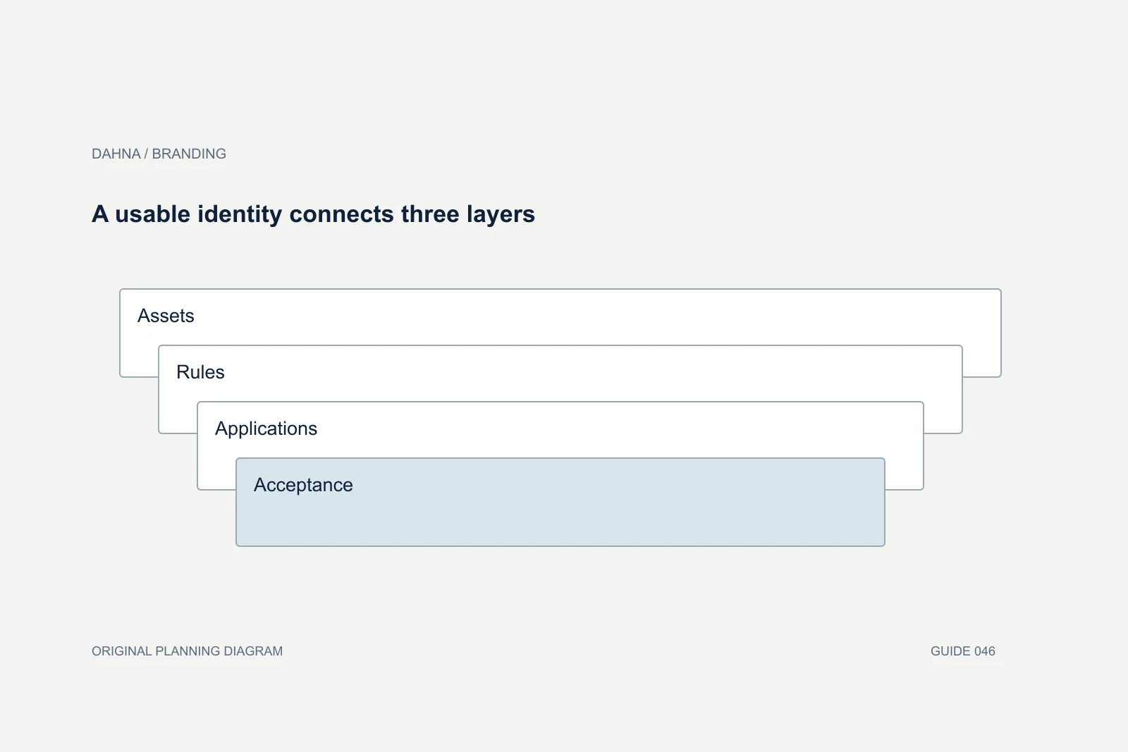
A usable identity connects three layers
Assets
Marks, type, color and imagery
Rules
Hierarchy, spacing and permitted combinations
Applications
Packaging, website and campaign formats
Acceptance
New content created by the actual team
Review design through the brief
Collect feedback against agreed criteria: readability, differentiation, fit with positioning, adaptability and production feasibility. ‘It feels expensive’ is too vague unless the team explains which design decisions create that impression and whether they fit the customer and product. Distinguish a personal preference from a problem that prevents the identity doing its job.
Review contrasting applications, including a minimal one. Some identities only appear distinctive when every decorative element is present. A strong system should still feel coherent in a plain shipping insert or a small email header. Do not force the smallest formats to carry the entire visual vocabulary.
Check the physical and digital constraints
Printed colors, material finishes and screen colors behave differently. Ask which proofs are included and who approves production files. A mockup is a communication tool, not evidence that a chosen finish can be produced at the required quantity or budget. Bring the packaging supplier into the process before finalizing unusual treatments.
For digital use, check readable type sizes, contrast and motion behavior where relevant. Confirm that a font license covers the intended web and commercial use. Keep licensing questions visible for the appropriate owner to resolve. The identity should not arrive with hidden dependencies that prevent the website team from implementing it.
Stress-test the identity with ordinary content
Use the least flattering but most common content in an acceptance exercise: a long product name, a small legal or factual text block, a low-information announcement and an inexpensive printed insert. The identity should still help readers find the important information. If it only works with short invented copy and perfect photography, the project has demonstrated an art direction rather than a complete working system.
Ask for one application with minimal design support. A customer-service email header or an internal presentation may have limited typography and layout options. Decide which cues carry recognition there and which can be omitted. This prevents staff from improvising a new mini-identity every time the full system is unavailable.
Also test a future product that differs in shape or category from the launch item. A tall bottle, a flat sachet and a device box can reveal whether the hierarchy is adaptable. The team need not finalize every future package, but it should understand how the system makes room for them. Record the tested examples and any intentional limits in the handoff. This gives the business a realistic view of what it has purchased and where another design phase may be needed.
Accept the system through a new application
Before final acceptance, ask the agency or your internal designer to create one fresh application from the delivered files and rules. This is a useful test of whether the system is understandable beyond the original presentation. Record where judgment is expected and where consistency is required.
Dahna’s branding and content work should make the connection between identity and daily production explicit. Bring your real packaging, website and campaign needs into the brief. The strongest deliverable is a coherent set of choices the team can use repeatedly while leaving room for new products and ideas.
Continue with the related decision
Use these guides when the next question goes beyond the scope of this article.
Use the editable decision sheet
Download the completed tables as a CSV, then replace the example inputs and add your evidence, owner and review date. Illustrative figures are teaching examples, not default targets.
Sources & further reading
Bring this decision to Dahna
Use this guide to prepare a focused brief. Tell Dahna what needs to change, which evidence you already have and when you need a decision.
Why consider Dahna for this work?
Dahna brings bilingual Korean and English strategy together with creator, content, and measurement work for brands growing in the US. You can review the people behind the recommendations and the kind of work we propose before starting a conversation.
Founder experience includes prior and contracted roles. Sample deliverables illustrate our approach; they are not client results or a performance promise.