How to plan Shopify navigation, collections and filters
Plan the catalog around the routes customers use to find products: product type, a meaningful shopping need and a small number of useful refinements. A navigation project should deliver a category map, product assignment rules and a maintainable filter data model before menus are styled.
Dahna, original planning diagram
In this article
Overview
Plan the catalog around the routes customers use to find products: product type, a meaningful shopping need and a small number of useful refinements. A navigation project should deliver a category map, product assignment rules and a maintainable filter data model before menus are styled.
Separate menus, collections and attributes
A menu is a set of routes. A collection groups products. A filter narrows the products already in view. Treating these as interchangeable creates menus full of tiny categories and collections that contain almost the same assortment. Start with a spreadsheet of products and the real attributes shoppers need, then decide which attributes deserve a destination.
For a skincare catalog, cleanser and moisturizer may be durable product categories. Texture can be a filter if enough products differ meaningfully. A temporary holiday promotion usually belongs in a campaign collection with an owner and an end date. These are planning examples; the right structure depends on the assortment and customer language, not a universal beauty menu.
Check that the data can support the promise
Shopify’s Search & Discovery documentation explains that filters depend on compatible storefront support and product data. Creating a filter in the app is insufficient if the theme cannot display it. Confirm this compatibility before designing an interface around unavailable behavior.
More often, the hidden problem is inconsistent data. ‘Fragrance free,’ ‘fragrance-free’ and an empty field may describe three different editorial decisions rather than three product properties. Ask the product owner to approve a controlled vocabulary and explain what an empty value means. Do not infer suitability or ingredient claims from marketing photographs. The catalog should only offer refinements the business can substantiate and maintain.
Build a map with clear responsibilities
The architecture document should explain why each route exists and which products belong there. A diagram alone does not tell the merchandising team what to do when a new SKU arrives. Add an inclusion rule, an exclusion rule and a person responsible for resolving uncertain cases.
Use collections sparingly enough that a shopper can predict what they will find. If two destinations have the same products and nearly identical introductions, consolidate the customer journey before commissioning more design. Search visibility is a separate review: a useful filter does not automatically need an indexable landing page.
| Layer | Example | Rule and owner |
|---|---|---|
| Top navigation | Cleansers | Merchandising approves the stable product-type vocabulary |
| Collection | Oil cleansers | Product type and format must match the documented definition |
| Refinement | Travel size | Product-data owner maintains an explicit size attribute |
| Campaign route | Winter routine | Campaign lead sets included products and expiry review |
Worked example: forty products and three competing menus
Imagine a European brand entering the US with forty products. Its old menu mirrors internal business units, its campaign team wants a menu by ingredient, and its customer service team receives questions about routine order. The project begins by asking representative shoppers to find a cleanser, choose a travel product and locate a product they already know.
If shoppers consistently start with product type, that becomes a strong candidate for the main menu. Routine education can remain a secondary route with links into those collections. Ingredient information can appear within product pages and selected guides rather than becoming fifteen shallow categories. This is a decision process, not a claim that one architecture always wins. Record conflicting observations instead of forcing every customer into the same browsing pattern.
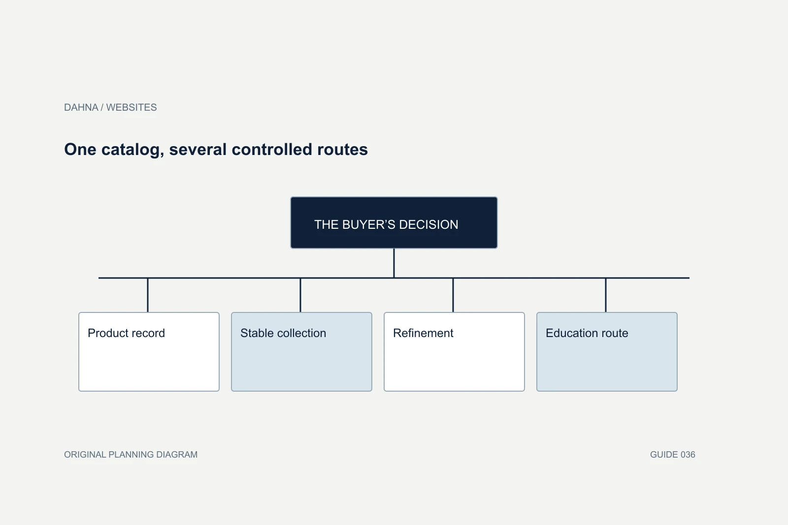
One catalog, several controlled routes
Product record
Approved type, format, size and availability
Stable collection
A predictable group with an inclusion rule
Refinement
A relevant attribute within the group
Education route
A guide that leads back to suitable products
Design for overlap without losing track of products
A product may legitimately appear in several collections. Keep one authoritative product record and decide which labels belong in data rather than duplicated product entries. Duplicate records can split reviews, complicate inventory and make merchandising harder to audit. Bundles also need a clear rule: distinguish a sellable bundle from an editorial routine assembled from separate products.
List awkward cases before build: a kit containing several categories, a product with two sizes, a discontinued shade, an item available only in one market and a refill that requires a compatible container. The agency should show where each case appears. If the answer is ‘we will decide while uploading,’ the design is relying on unresolved product decisions.
Move carefully from the old structure
Export the current navigation and collection destinations before making changes. Record campaign links, paid landing pages, retailer references and valuable search destinations that depend on them. A simpler menu does not require deleting every old URL. Existing public routes may need to remain accessible even when they no longer deserve top navigation space.
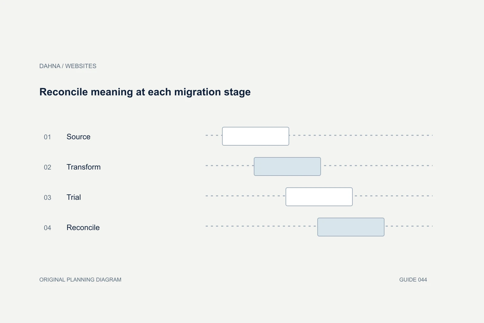
Build the new structure in preview, then test whether a product can be reached through its main category and an appropriate alternative route. Check mobile menus, empty collections and the behavior when inventory changes. A launch checklist should identify who will verify the product count and who can reverse an incorrect assignment without waiting for a code deployment.
Do not overbuild a small catalog
A six-product store may not need the same filters as a retailer with hundreds of items. A filter that reduces six choices to five adds interface work without necessarily helping someone decide. For a small assortment, clearer product cards, a simple comparison and a useful routine explanation may answer the question more directly. The architecture brief should allow that conclusion instead of assuming every available feature must be installed.
At the other extreme, a large catalog can make an apparently simple category ambiguous. ‘Treatment’ might include a leave-on serum, a rinse-off mask and a device. Ask customers what they expect under the label, then use a more precise structure or a clear explanation. Do not rely on internal departments to define the navigation unless shoppers use the same language.
Before approval, run a merchandising rehearsal with three hypothetical additions: a new size, a new product type and a limited seasonal kit. The coordinator should be able to place each one using the documented rules. If every addition requires an exception meeting, the structure may be too rigid or the definitions too vague. This exercise checks the architecture’s ability to support ordinary growth without turning the project into an attempt to predict every future product.
What to ask the agency to hand over
Request the category tree, the product-to-collection mapping, the attribute dictionary, filter configuration and a short merchandising guide. Include several completed examples rather than a blank template. The guide should explain how to add a new product, where to place a seasonal collection and how to retire a campaign route.
After launch, review search terms, customer questions and navigation use together. A rarely clicked category is not automatically useless; it might serve a small but valuable audience. Investigate whether the label is unclear, the route is buried or the assortment no longer supports it. Make one documented structural change at a time so the team can understand what improved and what became harder to find.
Continue with the related decision
Use these guides when the next question goes beyond the scope of this article.
Use the editable decision sheet
Download the completed tables as a CSV, then replace the example inputs and add your evidence, owner and review date. Illustrative figures are teaching examples, not default targets.
Sources & further reading
Bring this decision to Dahna
Use this guide to prepare a focused brief. Tell Dahna what needs to change, which evidence you already have and when you need a decision.
Why consider Dahna for this work?
Dahna brings bilingual Korean and English strategy together with creator, content, and measurement work for brands growing in the US. You can review the people behind the recommendations and the kind of work we propose before starting a conversation.
Founder experience includes prior and contracted roles. Sample deliverables illustrate our approach; they are not client results or a performance promise.