How to make ecommerce product filters easier to use
Use filters that represent meaningful, maintained product differences. Make active choices visible, let shoppers remove them easily and explain when a combination leaves no products. Test the complete task on a phone, including returning from a product page. The number of available filters is less important than whether people understand the remaining choice.
Dahna, original planning diagram
In this article
Overview
Use filters that represent meaningful, maintained product differences. Make active choices visible, let shoppers remove them easily and explain when a combination leaves no products. Test the complete task on a phone, including returning from a product page. The number of available filters is less important than whether people understand the remaining choice.
Choose the question each filter answers
Start with a real shopping task: find a gel cleanser under a particular price, compare fragrance-free moisturizers, or select a device with the required accessories. Write the product facts needed to complete that task before choosing filter labels. If the catalog cannot support the distinction consistently, a new control will expose the data problem rather than solve it.
A filter should describe a field with a stable meaning. “Best for you” is an unexplained recommendation, while size, format and price are inspectable differences. Beauty attributes require care: skin preferences, ingredient exclusions and medical claims are not interchangeable. Ask the product owner to approve the values and define how products are included. Do not infer an attribute merely because a marketing paragraph contains a related word.
Review how much choice the collection contains. A six-product range may need clear cards and a small comparison more than a large filter panel. A broad range with many shades or formats may benefit from stronger narrowing tools. The aim is to help a person choose, not to imitate the interface of a retailer with a much larger catalog.
Keep applied choices visible outside the filter panel
Baymard's mobile research shows examples where people must reopen filtering controls to remember the active selection. Its published comparison includes Williams Sonoma, Walmart, American Eagle and Living Spaces. The relevant lesson is that visible applied filters help users understand the current result set. These observations do not establish how any one design would affect your store's revenue.
Show the selected constraints close to the results, with a clear way to remove one or reset the set. Use labels that retain their meaning outside the panel: “Price: under $40” is clearer than an isolated “40.” If multiple values within a group are allowed, make the logic understandable. A shopper should not need to guess whether choosing two shades broadens the results or asks for a product that has both.
Preserve state when people visit a product and return. Losing the selected filters and scroll position can make comparison laborious. Test browser back behavior as well as an on-page return link. When the store cannot preserve a particular state, make the recovery predictable and visible rather than silently returning the shopper to a different list.
A filter decision sheet for a fictional moisturizer range
Imagine a fictional collection of 24 moisturizers. The team proposes filters for format, fragrance policy, package size and price. Before implementation, it discovers that six product records have no approved fragrance value and that “lightweight” appears in copy for both gels and creams. Those gaps matter because shoppers may read a filter as a factual promise about every included item.
The first release therefore uses verified format, package size and price. The fragrance filter remains unpublished until the product owner resolves all applicable records. Texture descriptions stay on the product cards while the team decides whether a consistent sensory vocabulary is possible. This is a narrower first release, but it is more useful than a complete-looking panel with unreliable assignments.
A task participant wants a gel below $35 and selects both filters. Two products remain. After visiting one and returning, the same two results and visible selections should remain. If the participant removes the price limit, the list should expand while preserving the format choice. Each expected behavior becomes an acceptance case, so the implementation can be evaluated without debating visual taste.
| Field | Definition needed | Release decision |
|---|---|---|
| Format | Approved gel, lotion or cream value per item | Publish after complete assignment |
| Fragrance attribute | Product-owner-approved definition and value | Hold while six records remain unknown |
| Package size | Consistent unit and variant behavior | Publish with unit visible |
| Price | Current market price and promotion treatment | Publish and test discounted states |
| Lightweight | Consistent supported sensory meaning | Keep as copy until a useful definition exists |
Design the empty state before launch
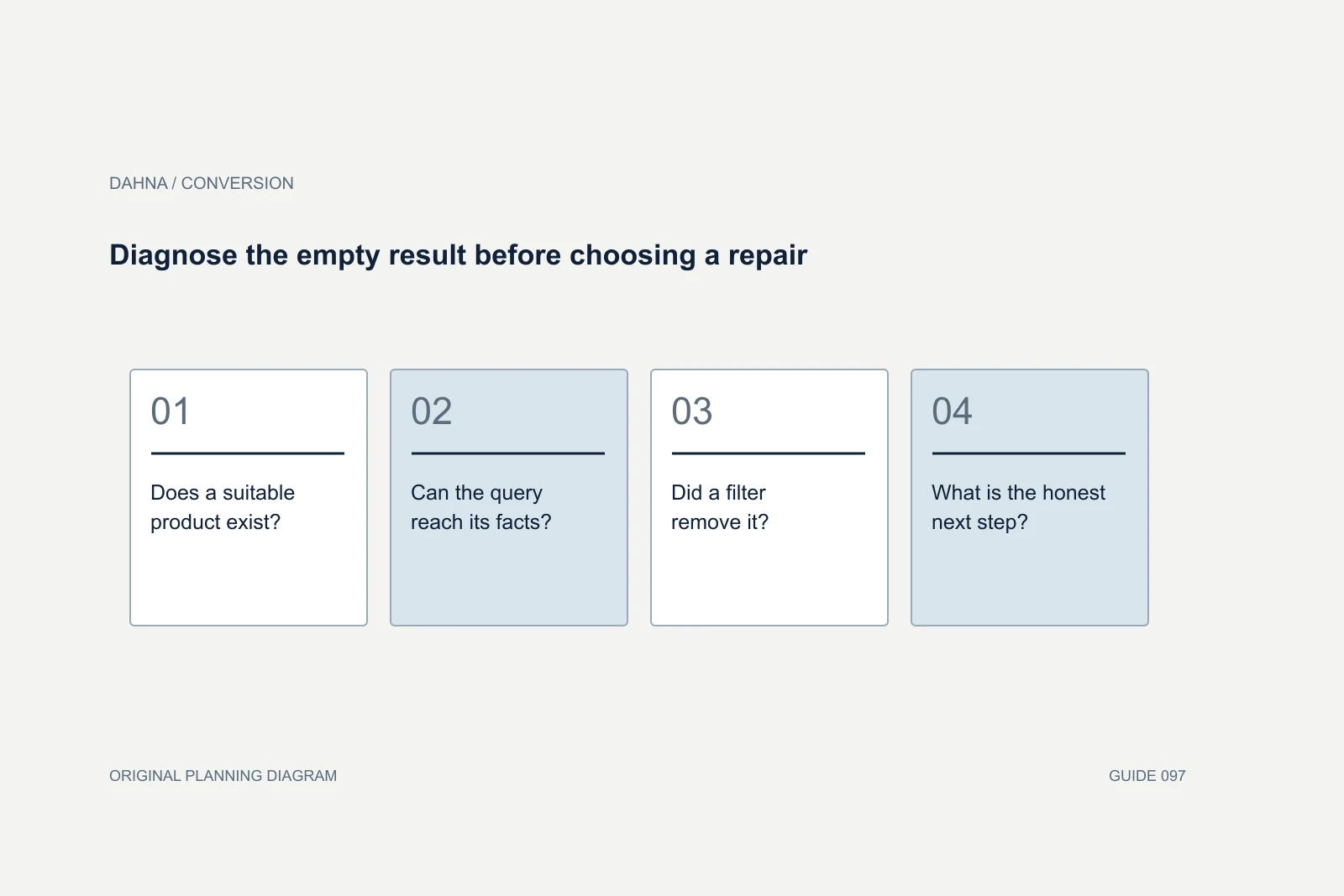
Some valid filter combinations will produce no products. Decide whether unavailable combinations are disabled with an explanation or allowed with a useful recovery state. Either approach needs testing with real catalog changes. A disappearing control can be confusing if the shopper cannot tell whether it was removed because of their selection or because the page failed to load.
When a combination is empty, preserve the applied choices and offer a specific way to broaden the set. Removing the most restrictive choice can be helpful when the interface explains what will change. Do not silently clear every filter and present an unrelated full catalog as though the original request succeeded. The person should remain in control of the compromise.
Keep sorting separate from filtering. “Price: low to high” changes order; “Under $35” removes items. A combined control can still work if those effects are clear, but analytics and acceptance tests should distinguish them. Otherwise the team may misread repeated sorting as successful product narrowing when users are actually struggling to find the right control.
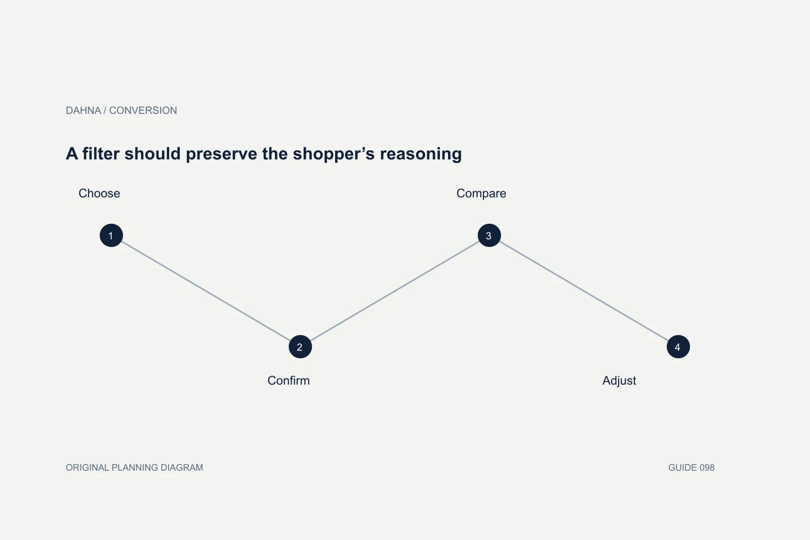
A filter should preserve the shopper’s reasoning
Choose
Select a clearly defined product difference
Confirm
See the active choice and resulting products
Compare
Open a product and return with state intact
Adjust
Remove one constraint without restarting
Test the states that screenshots cannot show
The acceptance set should include long labels, zero results, multiple selections, discounted variants, sold-out items and a slow network. Test keyboard access, focus movement and the announcement of result changes with the implementation's accessibility owner. A visually tidy drawer can still be difficult to operate if focus disappears when it closes or the apply button is outside the reachable area.
On mobile, ask whether people understand when changes take effect. Some panels apply immediately; others require an explicit action. The interface should communicate its model consistently. If results update behind a drawer, provide enough feedback to make the change understandable. Avoid displaying a count that does not match the results shown after closing the panel.
Coordinate with the SEO owner on URL behavior, but do not let indexing concerns dictate an unusable interaction. The faceted-navigation SEO guide covers crawl and canonical decisions. This project should document which shopper states need shareable URLs and which state must survive navigation, then let the implementation and SEO teams agree how to support them.
Ask for an accepted task, not a longer filter list
A useful agency deliverable includes the attribute dictionary, product-assignment rules, mobile interaction specification and completed acceptance set. Ask how missing values are handled and who updates the data when a new product launches. If the proposal assumes the catalog is already clean, identify the cleanup dependency before agreeing the timeline.
Measure filter use with context. People who use filters often have different intentions from people who do not, so their higher purchase rate would not prove that filters caused the difference. Review task completion, repeated resets, empty-result exposure and product-selection quality. A controlled comparison may be appropriate for a meaningful interface change when the store has enough eligible traffic.
Dahna can help scope the relationship between catalog content, website behavior and conversion review. Bring a collection where customers struggle to choose and the fields currently stored for its products. A focused project around that collection gives the team a concrete way to prove the new behavior works before expanding across the store.
Continue with the related decision
Use these guides when the next question goes beyond the scope of this article.
Use the editable decision sheet
Download the completed tables as a CSV, then replace the example inputs and add your evidence, owner and review date. Illustrative figures are teaching examples, not default targets.
Sources & further reading
Bring this decision to Dahna
Use this guide to prepare a focused brief. Tell Dahna what needs to change, which evidence you already have and when you need a decision.
Why consider Dahna for this work?
Dahna brings bilingual Korean and English strategy together with creator, content, and measurement work for brands growing in the US. You can review the people behind the recommendations and the kind of work we propose before starting a conversation.
Founder experience includes prior and contracted roles. Sample deliverables illustrate our approach; they are not client results or a performance promise.