How to scope a mobile ecommerce usability audit
A mobile usability audit should show where people struggle to complete important shopping tasks on real phones, then turn those observations into reproducible fixes. Screenshots and a generic best-practice score are insufficient to explain why a customer cannot choose, understand or buy a product.
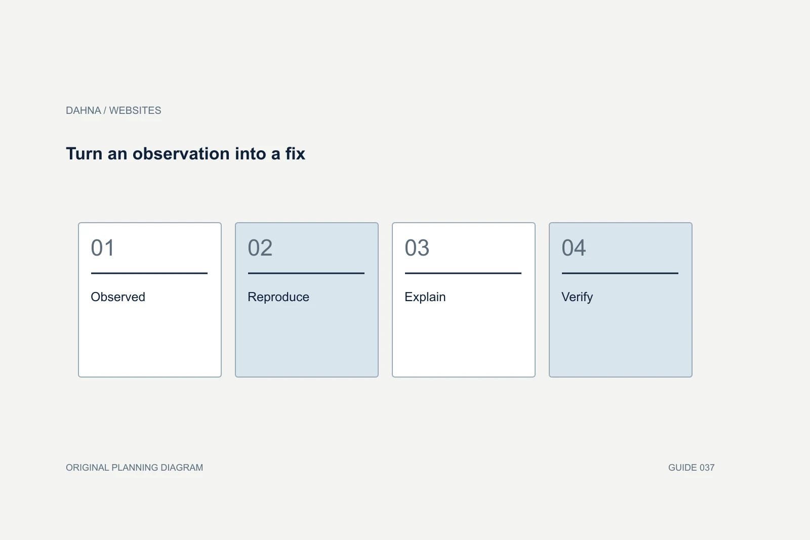
Dahna, original planning diagram
In this article
Overview
A mobile usability audit should show where people struggle to complete important shopping tasks on real phones, then turn those observations into reproducible fixes. Screenshots and a generic best-practice score are insufficient to explain why a customer cannot choose, understand or buy a product.
Begin with the customer’s job
Choose tasks that reflect a real purchase decision. Finding a moisturizer, comparing two sizes, checking a delivery estimate and correcting a cart quantity are better prompts than ‘explore the website.’ Include one returning-customer task and one unfamiliar-customer task if both groups matter. Their needs can differ sharply.
Avoid giving away the navigation label in the instruction. ‘Find a fragrance-free cleanser’ tests a shopping goal; ‘open Shop by Concern and select Sensitive’ tells the participant how the designer expects the site to work. Capture what the person tries, what they believe happened and where they need help. Their explanation often reveals a content problem that a technical audit would miss.
Use a small study for discovery, not population estimates
Nielsen Norman Group’s guidance on mobile usability testing emphasizes observing tasks on mobile devices. That research tradition is useful because phones introduce keyboard, touch and screen constraints that a desktop screenshot cannot represent. A study should record the device and environment alongside the finding.
A handful of sessions can expose a reproducible obstacle. It cannot establish that a precise percentage of all customers will abandon because of that obstacle. Report the observation plainly: three participants missed the size selector in this study. Then inspect analytics or run a later experiment if you need to estimate business impact. Avoid converting qualitative evidence into an unsupported revenue forecast.
Agree on a compact but realistic test matrix
Use the store’s own device and browser mix to choose coverage. Where analytics is incomplete, disclose that and include a reasonable range of current phone sizes and operating systems. Test the keyboard open, a slow connection, an error message and a product with long copy. These are states where layouts often break.
Ask the agency to distinguish a browser defect from a comprehension issue. A button hidden behind a cookie banner requires a different fix from a button whose wording is unclear. Both can prevent progress, but the implementation and verification should match the cause.
| Task | State to include | Evidence to capture |
|---|---|---|
| Select a shade | Long shade name and unavailable variant | Recording of selection and resulting product state |
| Read product evidence | Zoomed text and expanded accordion | Legibility and access to the complete explanation |
| Enter delivery details | Keyboard visible and validation error | Focus behavior and recoverable error |
| Edit cart | Quantity change and removed item | Updated total, confirmation and undo path |
Worked example: the disappearing purchase action
Consider a fictional skincare-device store whose mobile product page includes a sticky purchase bar, a chat launcher and a promotion banner. In a session, a participant opens the keyboard to enter a discount code, dismisses it, then cannot reach the cart action because the overlays cover it. The person assumes the site has stopped working.
The issue report should name the exact device, browser, page, screen state and reproduction steps. Attach a short recording and specify the expected behavior: the purchase control remains reachable, overlays can be dismissed and keyboard focus does not become trapped. This is more actionable than ‘improve mobile conversion.’ The team can verify the fix before spending time on broader redesign preferences.
Turn an observation into a fix
Observed
Shopper cannot reach the cart action
Reproduce
Same device, overlay and keyboard state
Explain
Competing fixed elements cover the control
Verify
Task completed with overlays and keyboard tested
Prioritize by consequence and confidence
Classify an issue by what it prevents. A blocked checkout is different from a slightly awkward swipe. Include how often the affected state occurs, the audience exposed and whether a workaround is visible. Keep confidence separate: a defect reproduced reliably deserves a different treatment from a concern inferred from one screenshot.
The audit should contain a manageable repair queue with owners. A hundred unranked observations can overwhelm a small team and leave the most serious problem untouched. For each proposed fix, include the page or component affected, dependencies, expected effort range from the implementer and a retest method. Business impact can remain unknown without making the usability finding invalid.
Recruit for the buying situation
A US launch for a Korean brand should include people who do not already understand the brand’s product naming or routine conventions. A study limited to employees may miss explanations that new customers need. Recruit people who resemble the intended shoppers in relevant behavior, while avoiding unnecessary collection of sensitive personal information.
Use test payment details and a safe test environment for checkout tasks. Do not ask participants to expose private passwords, payment information or unrelated browsing history. Obtain permission for recording and define who can access it. The research brief should also include participants with relevant accessibility needs when the project’s scope calls for that expertise; general testing does not replace an accessibility evaluation.
Separate a broken task from a difficult choice
Suppose a participant cannot decide between two moisturizers. The mobile layout may work perfectly: both pages load, controls respond and text is readable. The difficulty could be missing product distinctions rather than a mobile defect. The report should record the observation and route it to the content or merchandising owner instead of prescribing larger buttons as a universal solution.
Conversely, a participant may know exactly what they want but be unable to select a size because a sticky banner covers the control. That is a reproducible interface barrier. Keeping these categories separate makes the repair queue more credible and prevents the website team from being asked to solve an unresolved product proposition through layout alone.
For acceptance, repeat the relevant task with the corrected experience and observe the action without coaching. If the participant succeeds only after the moderator explains where to tap, the interface has not demonstrated independent usability. If the task succeeds but takes an unexpected route, investigate whether that route is acceptable rather than marking it wrong because it differs from the designer’s plan. The audit should respect how customers actually shop while identifying the moments that prevent a clear, confident next step.
Require a retest, not just a presentation
The final package should contain task scripts, participant criteria, recordings or consented excerpts, an issue register and a concise decision memo. The memo explains which fixes can ship immediately and which need design exploration. Keep personal data out of the broadly shared report.
Book a retest against the same tasks after changes are implemented. Use fresh participants for questions about discoverability, because people who have already learned the interface may no longer reveal the same confusion. Check that fixing one obstacle has not introduced another on a neighboring template. A useful audit ends with evidence that the customer can complete the task more clearly, while any claim about sales improvement waits for appropriate measurement.
Continue with the related decision
Use these guides when the next question goes beyond the scope of this article.
Use the editable decision sheet
Download the completed tables as a CSV, then replace the example inputs and add your evidence, owner and review date. Illustrative figures are teaching examples, not default targets.
Sources & further reading
Bring this decision to Dahna
Use this guide to prepare a focused brief. Tell Dahna what needs to change, which evidence you already have and when you need a decision.
Why consider Dahna for this work?
Dahna brings bilingual Korean and English strategy together with creator, content, and measurement work for brands growing in the US. You can review the people behind the recommendations and the kind of work we propose before starting a conversation.
Founder experience includes prior and contracted roles. Sample deliverables illustrate our approach; they are not client results or a performance promise.